Senior Farmers Market Nutrition Program
Senior Food Assistance Program
Summary
ONIE is a senior-focused food assistance program that partners with farmers markets to provide fresh produce to low-income seniors. At the time, their operations were entirely analog—printed applications, mailed forms, and physical tokens. My role was to help design a digital process that was not only efficient but approachable for a non-tech-savvy audience.
My Role
Product Designer
My Contributions
Discovery UI/UX Strategy Wire-framing Product Design
Tools
Figma FigJam Adobe Illustrator Jira Confluence
Date
2021
The Problem
The program had the capacity to support 200 seniors. To manage this, they printed and mailed 200 applications. If someone didn’t return theirs, their spot remained “pending,” which stalled the entire system. The reliance on paper created bottlenecks and made it hard for the admin team to respond to real-time needs.
The Objective
Build a digital system that preserves accessibility for seniors while streamlining backend operations. The challenge? Many users weren’t familiar with digital tools—or didn’t even have internet access. We needed a system that was modern but still met people where they were.
The Approach
We identified three key user groups, each with distinct needs: Seniors, Volunteers, and Admins. Seniors The goal was to make the experience feel familiar and unintimidating. I designed a step-by-step flow that mirrored a simple onboarding process, with minimal UI elements and larger text for easier reading. The dashboard let users check their status and edit info—no unnecessary features or visual clutter. We also had to plan for seniors without phones or internet access. Volunteers Volunteers helped seniors on-site at the farmers markets. For them, we designed a mobile-friendly shortcut flow that skipped all but the most essential information. It allowed them to qualify seniors on the spot without forcing them through the entire application process. Admins Admins needed oversight. We created a dashboard that tracked application data in real time. Instead of relying on paper records and manual updates, they could now see who had applied, who needed follow-up, and how many slots were still open—all at a glance.

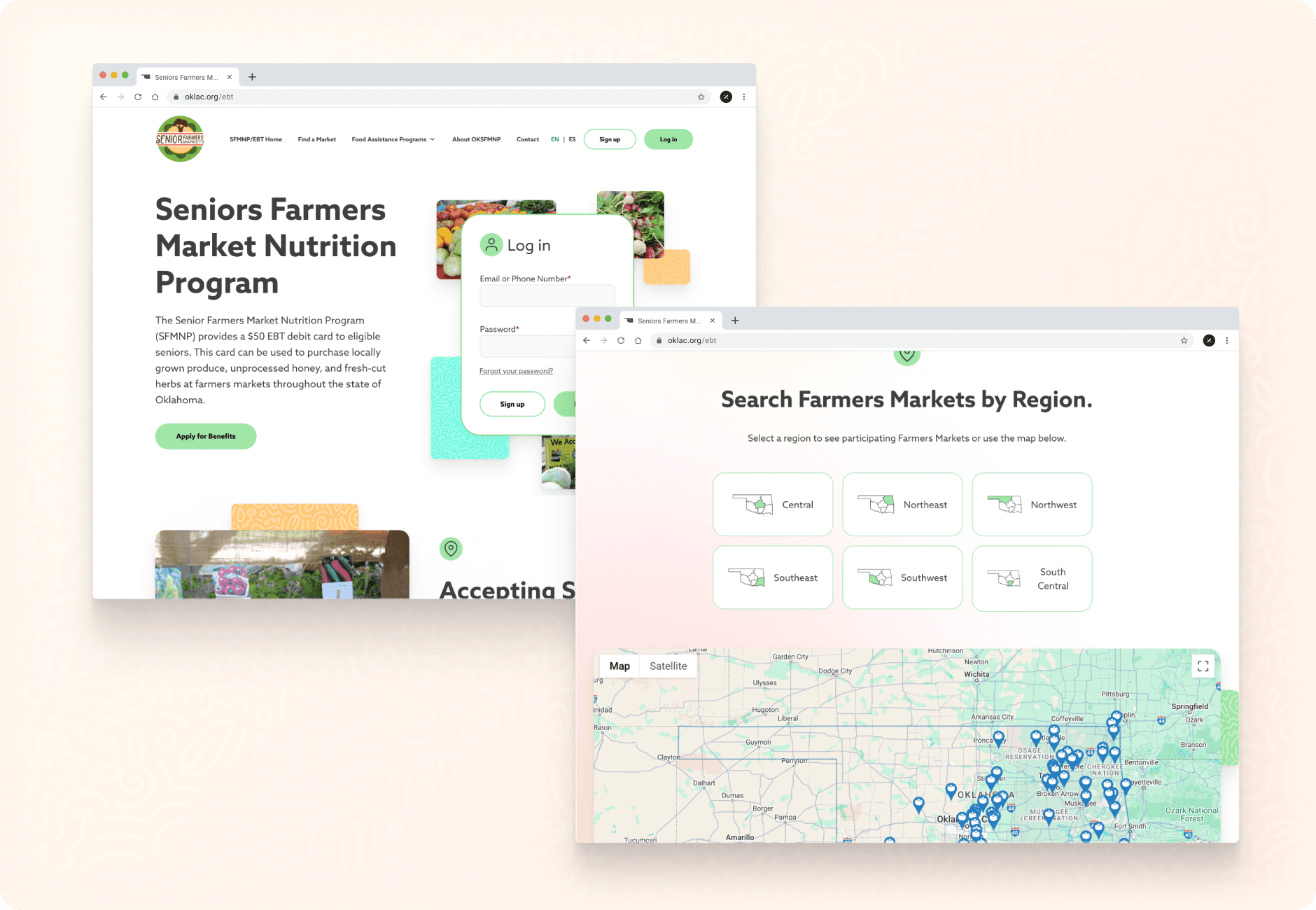
A simple UI with slightly larger elements was created to have easier legibility for the seniors using the platform.
The Outcome
The new system made it possible for the team to enroll more seniors, faster. Without the delays of paper mail, available spots weren’t stuck in limbo. This led to a measurable bump in qualified applicants and improved turnaround times, which ultimately helped the program secure additional funding to grow.
What I Learned
Designing for accessibility isn’t just about color contrast or legible fonts—it’s about understanding context and simplifying the experience for people who may not be confident using technology. Working with ONIE pushed me to consider edge cases more thoughtfully and design solutions that could function both digitally and in-person. It also reinforced how crucial clear admin tools are in enabling organizations to scale their impact.